Chanin
Estates
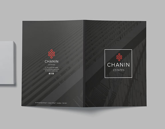
The Brief
With British and Chinese heritage, the brief from the team at Chanin Estates was simple... To embody these two historically rich nations into a unique brand that stood out in a heavy footfall area of Central London, that only deals with high end properties.
THE SOLUTION
During my research it became clear that a combination logo would work best for this brand project, to bring together British and Chinese heritage. During the creative stage and several sketches later I created a brand mark symbolising a Chinese knot. The knot represents the journey they take high end clients on. The Chanin team were all agreed on this design and felt it truly represented their business. Red and black are standard colours in some Chinese cultures representing elements of the earth. Red also represents energy and good fortune and it's widely known that red enveloped containing money is given as gifts to symbolise good luck and good fortune, which is one of they key takeaways from the brand discovery that the team at Chanin wanted to have their clients feel when working with them.